
You’ve invariably picked up a Beatle LP, seen that famous green apple, got an emorous sense of well-being, and got on with your day (unless you’re one of those terrible hipsters who think it’s fashionable to hate The Beatles – you do you, boo).
Anyway, the famous split apple across two sides of a Beatle Product are all well and good, but did you know that there’s so much more going on? Did you know about the different colourways and all that? If you did, enjoy looking at them again and if you didn’t, welcome to some unimportant but ultimately fun information.
RED APPLE
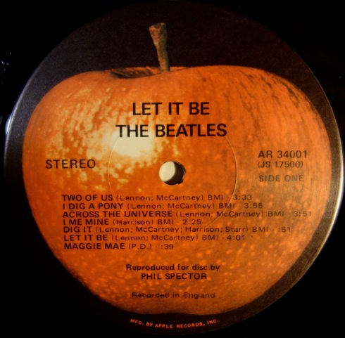
A red apple? This has to be an American thing right? RIGHT! One of the US editions of ‘The Beatles ‘Let It Be’ veered from the green apple because it wasn’t issued on the usual distro label of Capitol, but rather, United Artists. Now, if you’re thinking of buying one of these, careful, this is one of most bootlegged Beatle releases on the market.
There’s also a fun rumour that, as this was the last Beatles LP, red was chosen because the apple was ‘ripe’, and finally ready to be picked. We’re not sure that’s true, but it sure is fun.
BLUE APPLE
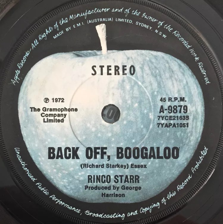
Ringo, who also went red for a release, decided to give us a bit of blue in 1972 for his hit, ‘Back Off, Boogaloo’. It’s a fun little twist on the normal format and, while it isn’t especially pricey or collectible, if you’re a Beatle nut, then this is a lovely thing to have in the collection. You’ll probably see one down the charity shops if you’re willing to wait.
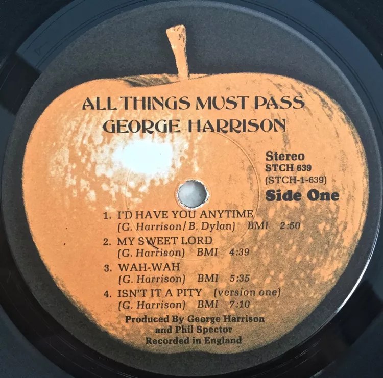

For his epic solo LP, ‘All Things Must Pass’, George Harrison decided to go triple on an orange version of the apple. Alongside the bright orange, he’d also use the custom ‘Apple Jam’ label. Harrison would use other custom labels too, but these are the coolest pair.
ZAPPLE APPLE
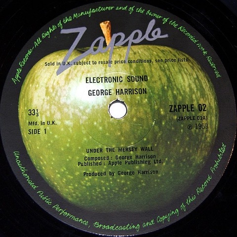
Apple’s electronic wing was called Zapple where they released more experimental works (bearing in mind this is a band that put out ‘Revolution No.9’ on one of their regular releases, you wonder what might have been if they persevered with it). There were 2D variants on this sleeve too, which are a lovely bit of design.
WHITE APPLE
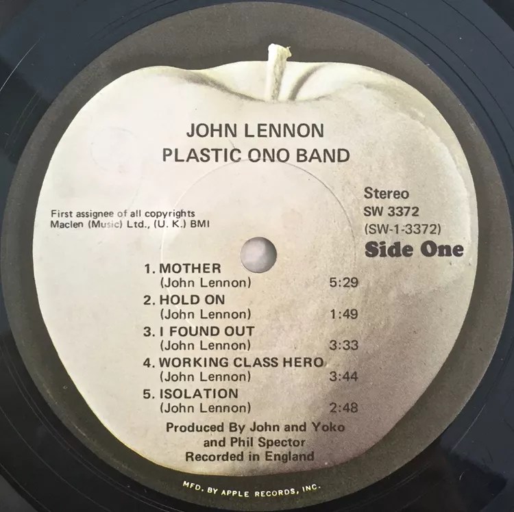
Whether it’s white for peace or to reflect the stark music on the Plastic Ono Band LP, we’re not sure. Either way, it looks cool as hell. Other versions of the label were even more stark, being just a white outline of an apple.
APPLE CORE
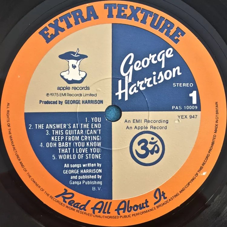
On the ’75 solo LP ‘release ‘Extra Texture’, Harrison included a small apple that had been chewed up. Feels very George, doesn’t it? An apple that’s a shadow of it’s former self? Who knows, but it’s a fun thing dripping in George’s usual sarcasm.
OTHER APPLES
There’s other variants with differing typefaces/fonts, different background colours and all that good stuff. Go have a nosey yourself. Record label variants is good, clean, nerdy fun and you should definitely get into them.

Leave a comment